


Country level COVID-19 curves in Europe
Update as of 31.12.2021

This is the last one of 2021 !
[see bottom for data sources & links to all graphics in png format] all graphics, ordered by country iso code, on 1 page here: https://godlak1.github.io/covid19/c19europe.html
Please feel free to share as widely as possible your country’s c-19 graphics, especially in front of all the rona apparatchiks who according to the current stage of wisdom & rona propaganda nudging will only show partial information but never the full picture!
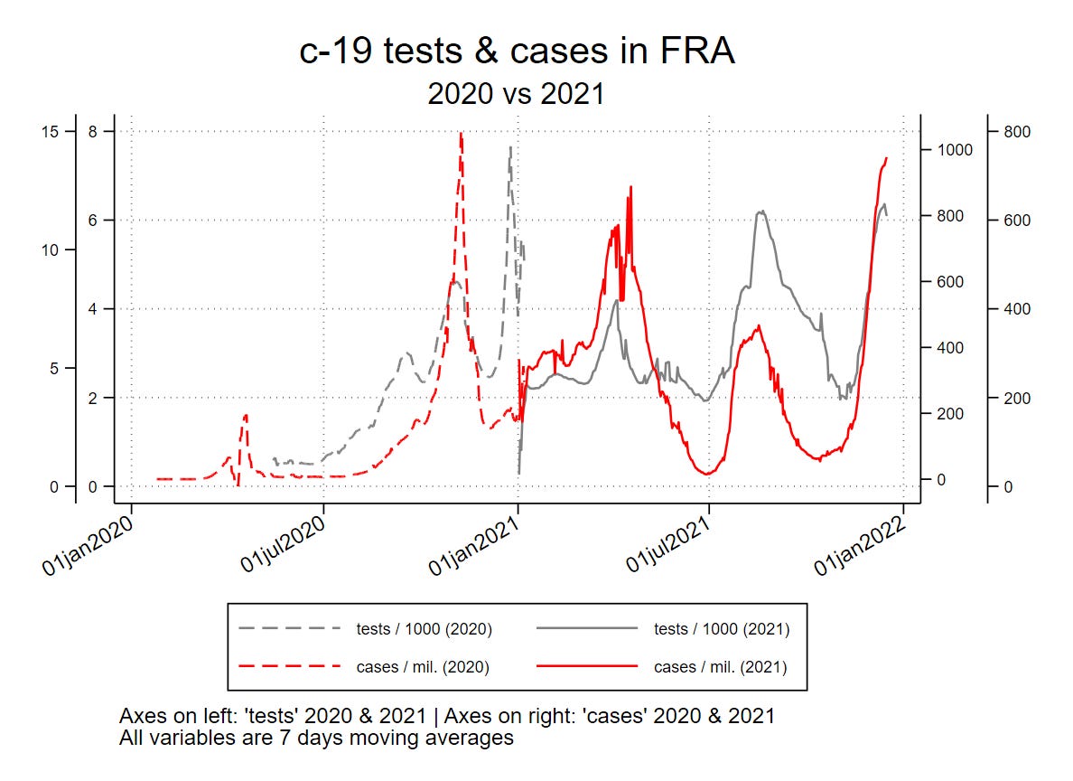
Let me just show and discuss here 2 countries : France & Poland

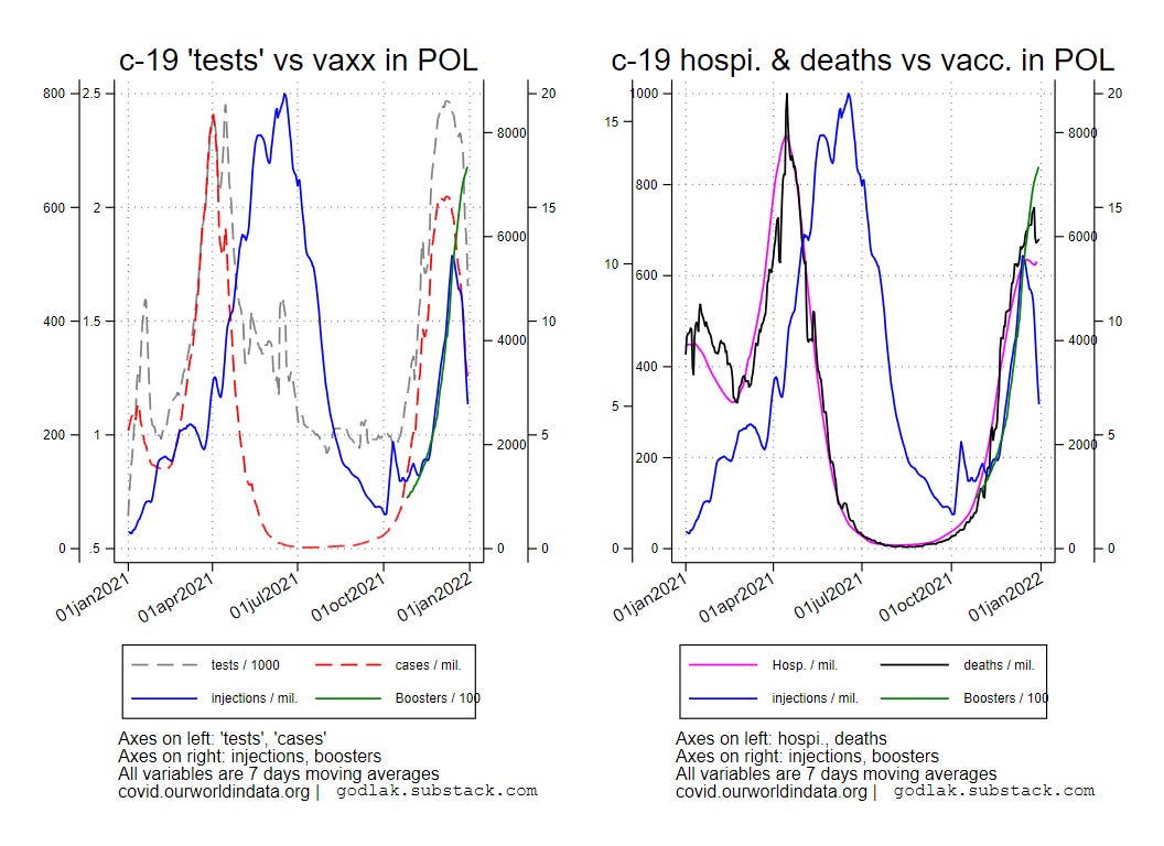
The “test” remains the “virus”. Seasonality moves from East to West. Poland reached the winter peak. France should soon, although the “testing” frenzy is just insane… Just look at the graphics below comparing 2021 vs 2020 :
[notice the injections, “testing”, and “cases” curves co-tango…]

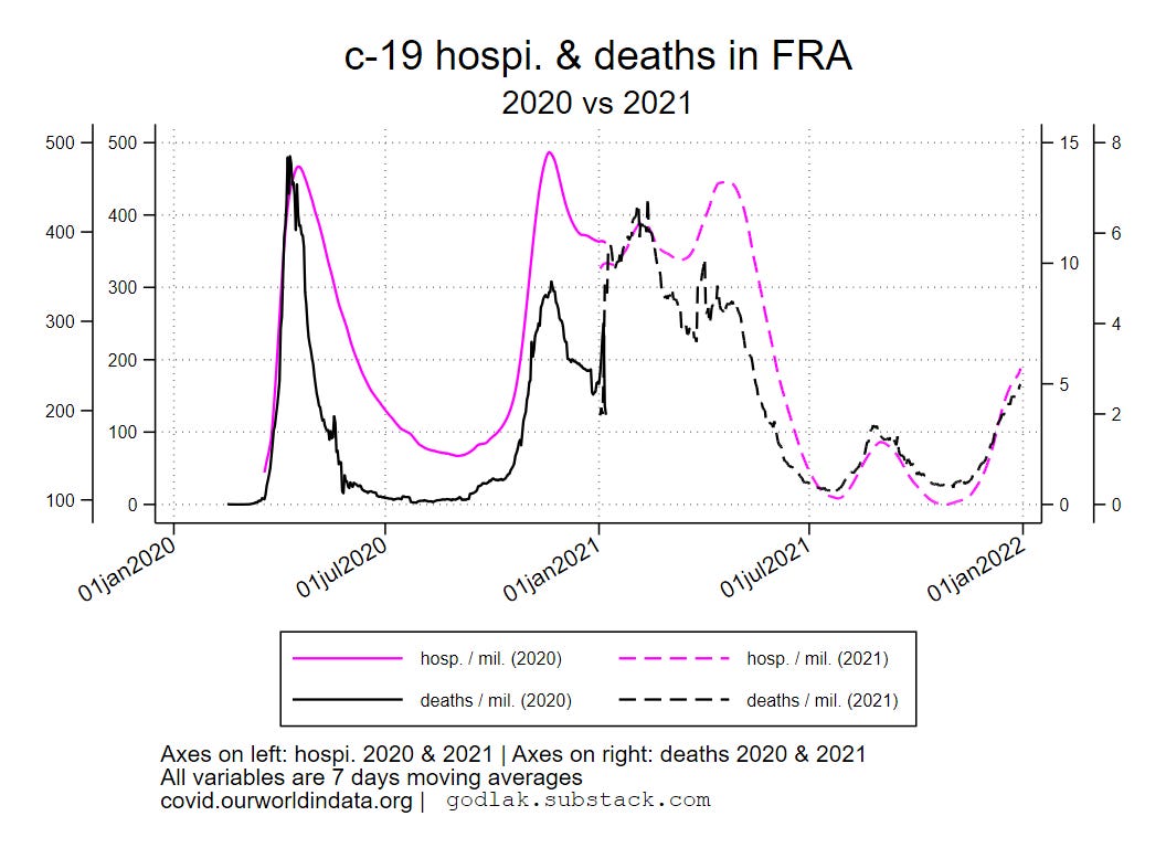
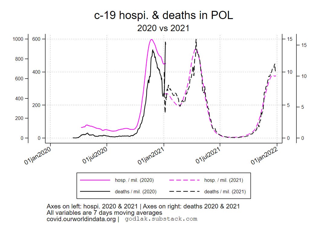
The good news is that c-19 hospitalizations and deaths are lower this season.


All causes deaths follow a similar seasonal pattern, and seem to be lower this year.
Data sources : https://ourworldindata.org/coronavirus & https://ec.europa.eu/eurostat/

[only countries with full data available for all variables are used (no eurostat data for UK though…)]

For c-19 (…) graphics, variables used are (all smoothed using 7 days moving average transformation): new “tests” / 1000, new positives / million, hospitalizations / million, deaths / million, new “vaccinations” / million, boosters / 100.

For all deaths (…) graphics, variables used are: all deaths (weekly), c-19 new deaths / million (weekly sum), new “vaccinations” / million (weekly sum), boosters / 100 (weekly sum).All graphics (png format) also available here: https://mega.nz/folder/T2omgIaa#ISqHFuLt2bx3fHaBdNrm6A