


Country level COVID-19 curves in Europe
Update as of 14.01.2022

[see bottom for data sources & links to all graphics in png format] all graphics, ordered by country iso code, on 1 page here: https://godlak1.github.io/covid19/c19europe.html
Please feel free to share as widely as possible your country’s c-19 graphics, especially in front of all the rona apparatchiks who according to the current stage of wisdom & rona propaganda nudging will only show partial information but never the full picture!
Let me just show and discuss here 2 countries : France & Poland
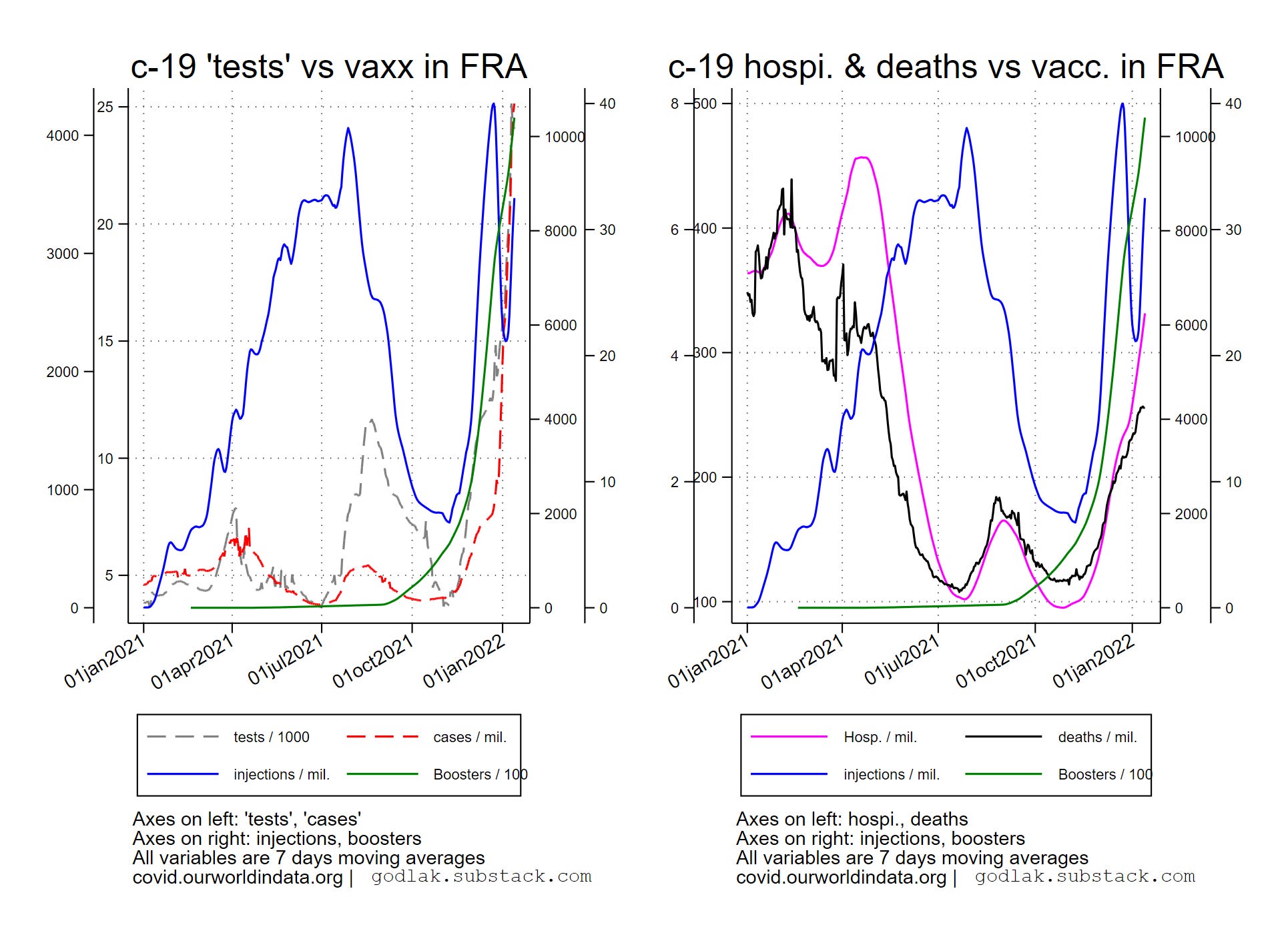

The nasal sodomy continues in France driving all the madness… 3rd injections picked up after a recent fall… hospitalizations labelled “c-19” are on a good way to reach the spring 2021 peak (with much less “vaxx” coverage at that time)…
Similar trends in Poland however the “testing” and “cases” madness seem to have reached another seasonal peak (which comes sooner in East)… as this drives everything, the rest of the curves also start falling (hospitalizations and deaths labelled “c-19”).


Total deaths remain relatively stable in France while they have peaked in Poland. In both countries this metric is comparable at around 12k.
Data sources : https://ourworldindata.org/coronavirus & https://ec.europa.eu/eurostat/

[only countries with full data available for all variables are used (no eurostat data for UK though…)]

For c-19 (…) graphics, variables used are (all smoothed using 7 days moving average transformation): new “tests” / 1000, new positives / million, hospitalizations / million, deaths / million, new “vaccinations” / million, boosters / 100.

For all deaths (…) graphics, variables used are: all deaths (weekly), c-19 new deaths / million (weekly sum), new “vaccinations” / million (weekly sum), boosters / 100 (weekly sum).All graphics (png format) also available here: https://mega.nz/folder/T2omgIaa#ISqHFuLt2bx3fHaBdNrm6A