


Country level COVID-19 curves in Europe
Update as of 17.12.2021

Another friday, another portion of rona graphics!
Because showing all curves in one graphic gives the bigger picture...
[data sources & links to all graphics at the bottom] [all graphics ordered by country iso code on 1 page: https://godlak1.github.io/covid19/c19europe.html]
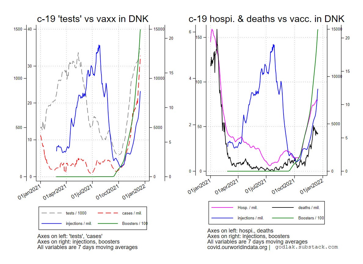
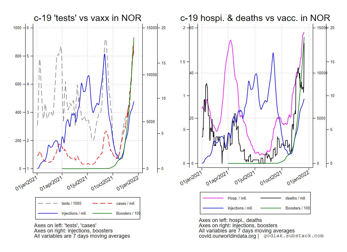
c-19 graphics by ISO-code (random order)


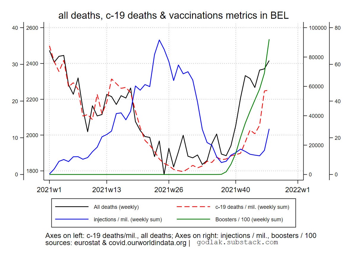
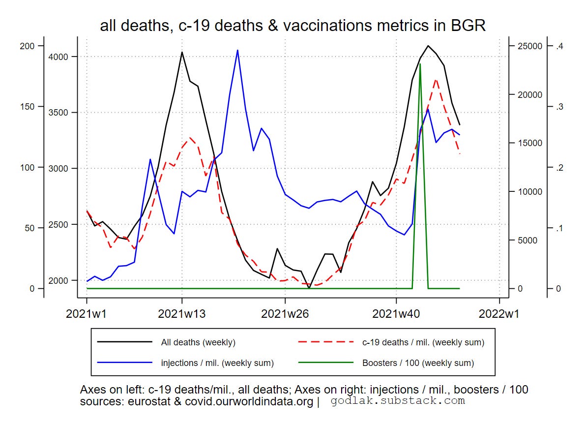
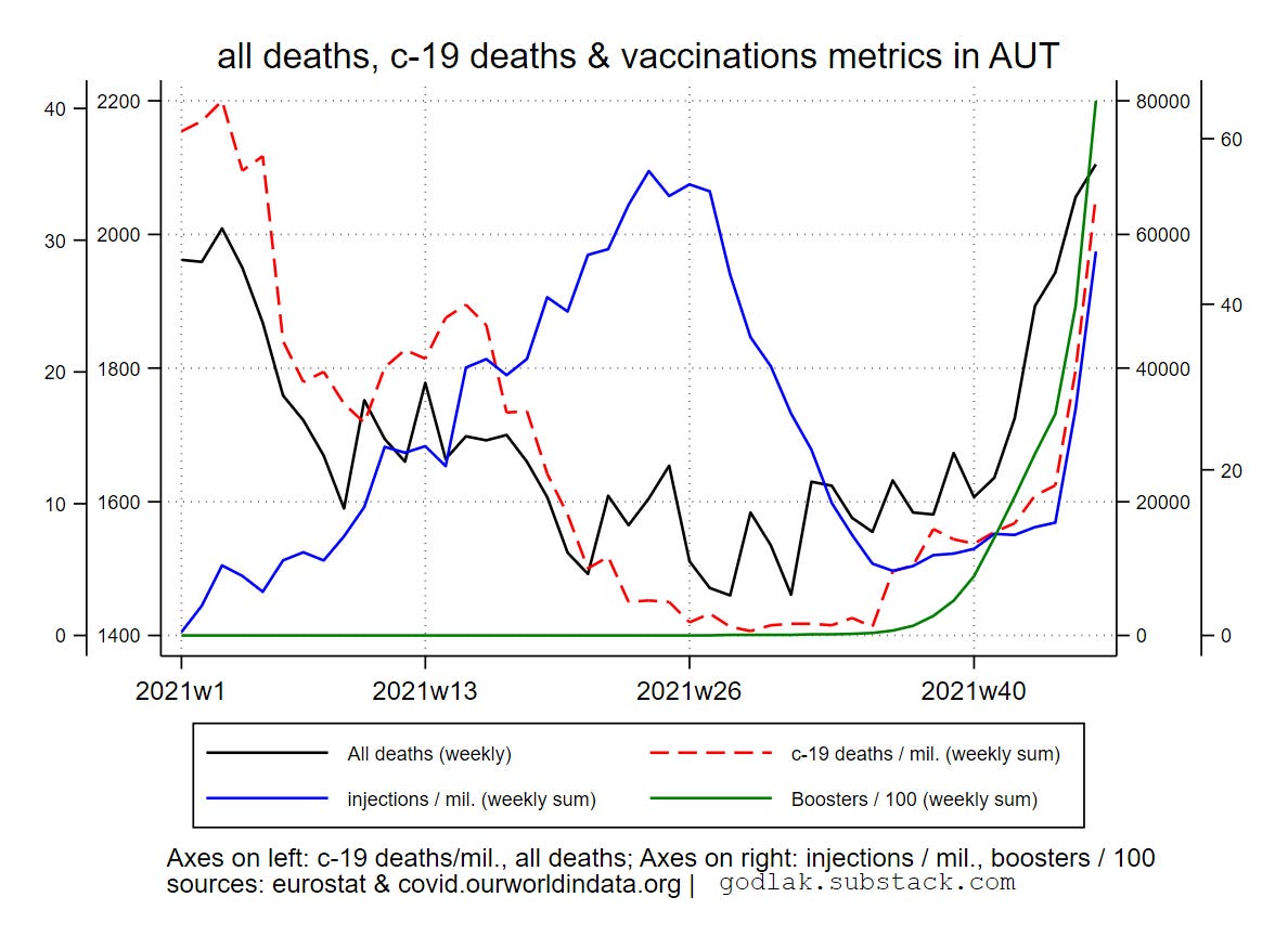
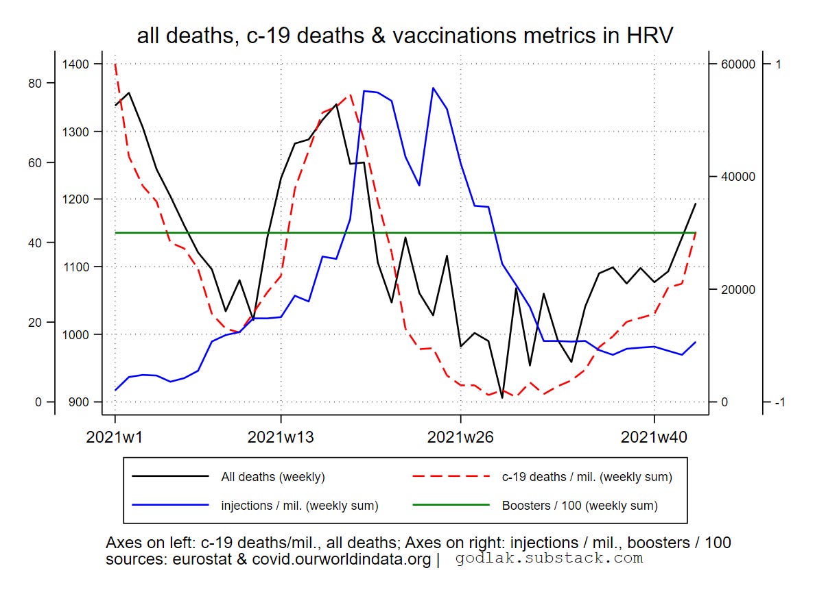
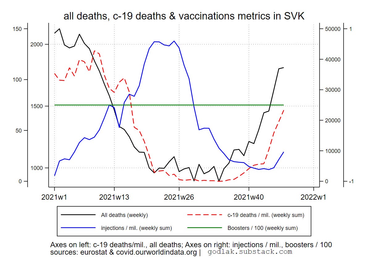
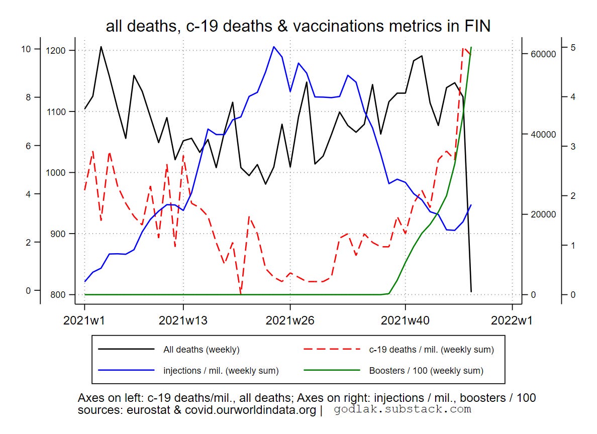
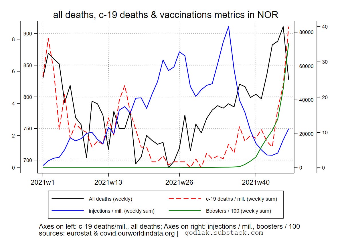
all deaths and c-19 by ISO code (random order)


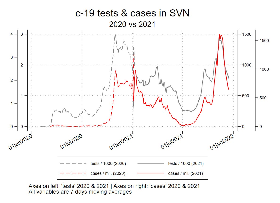
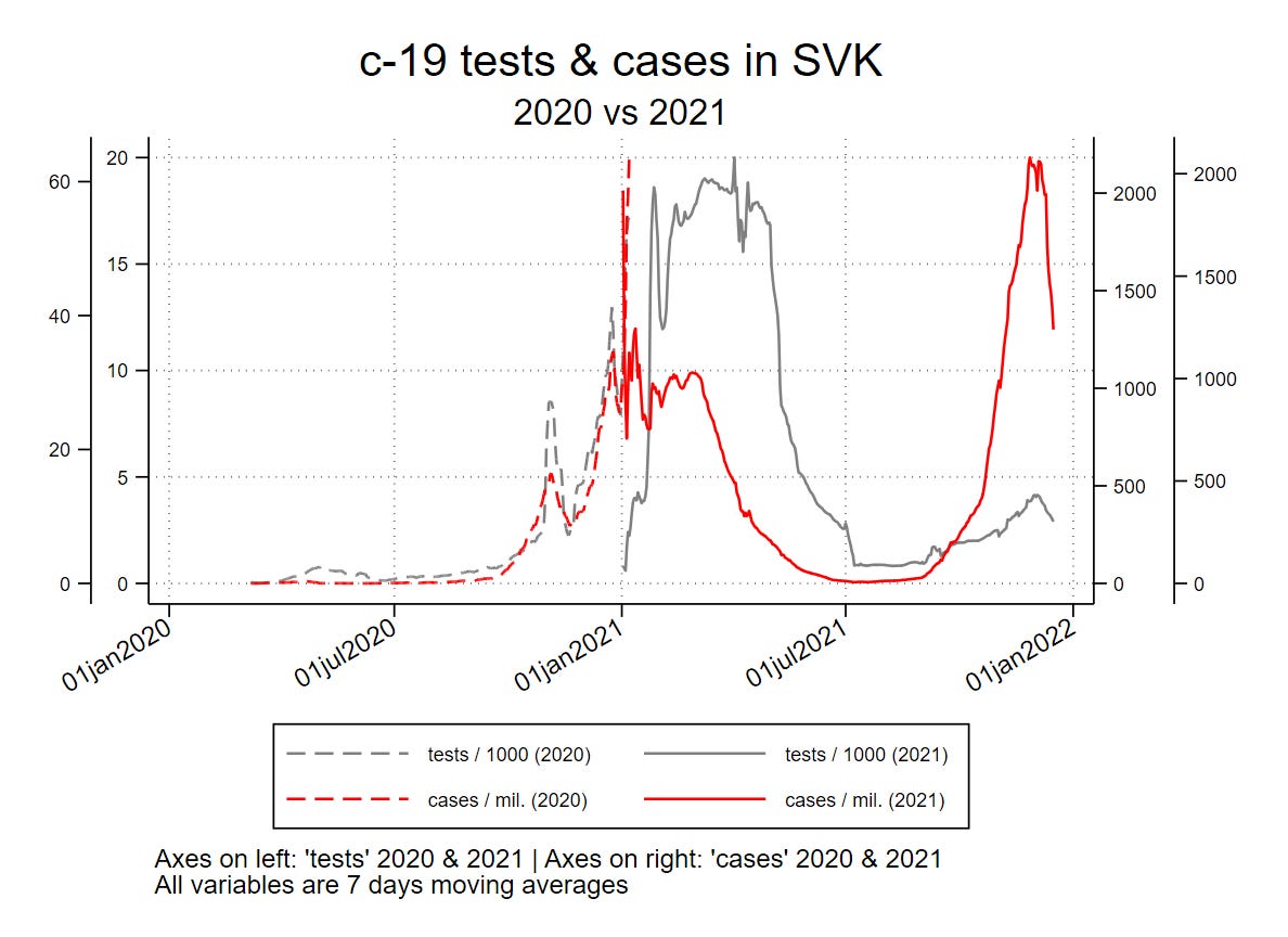
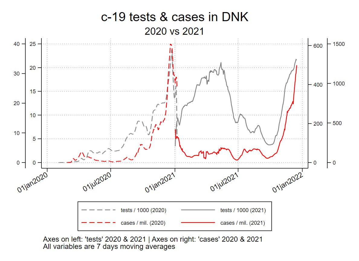
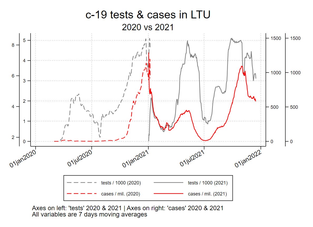
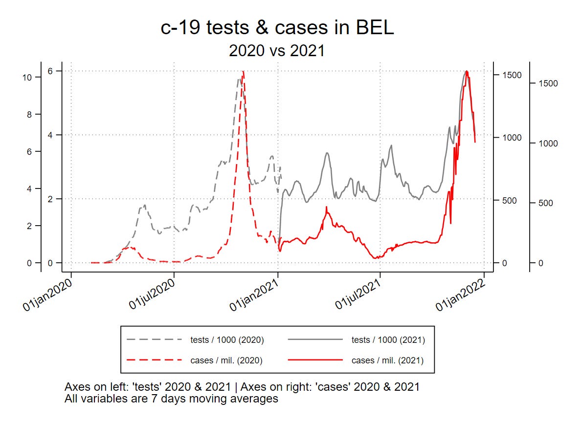
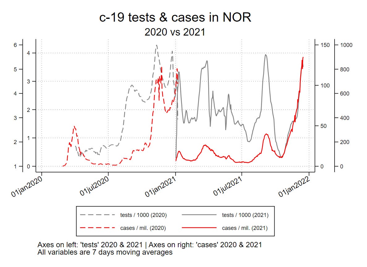
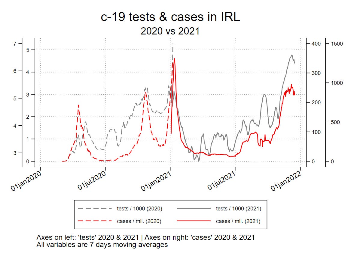
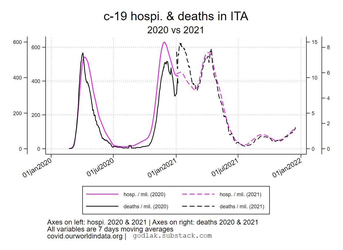
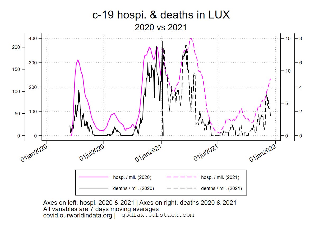
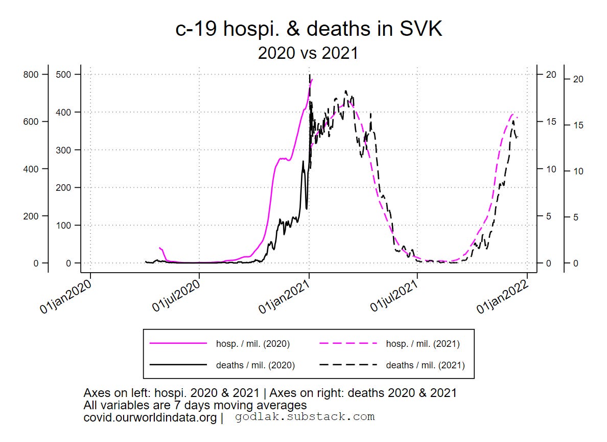
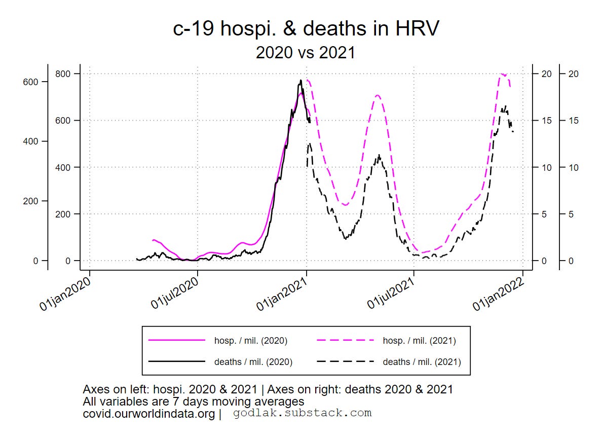
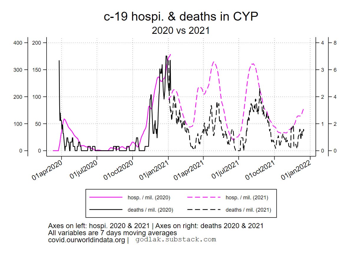
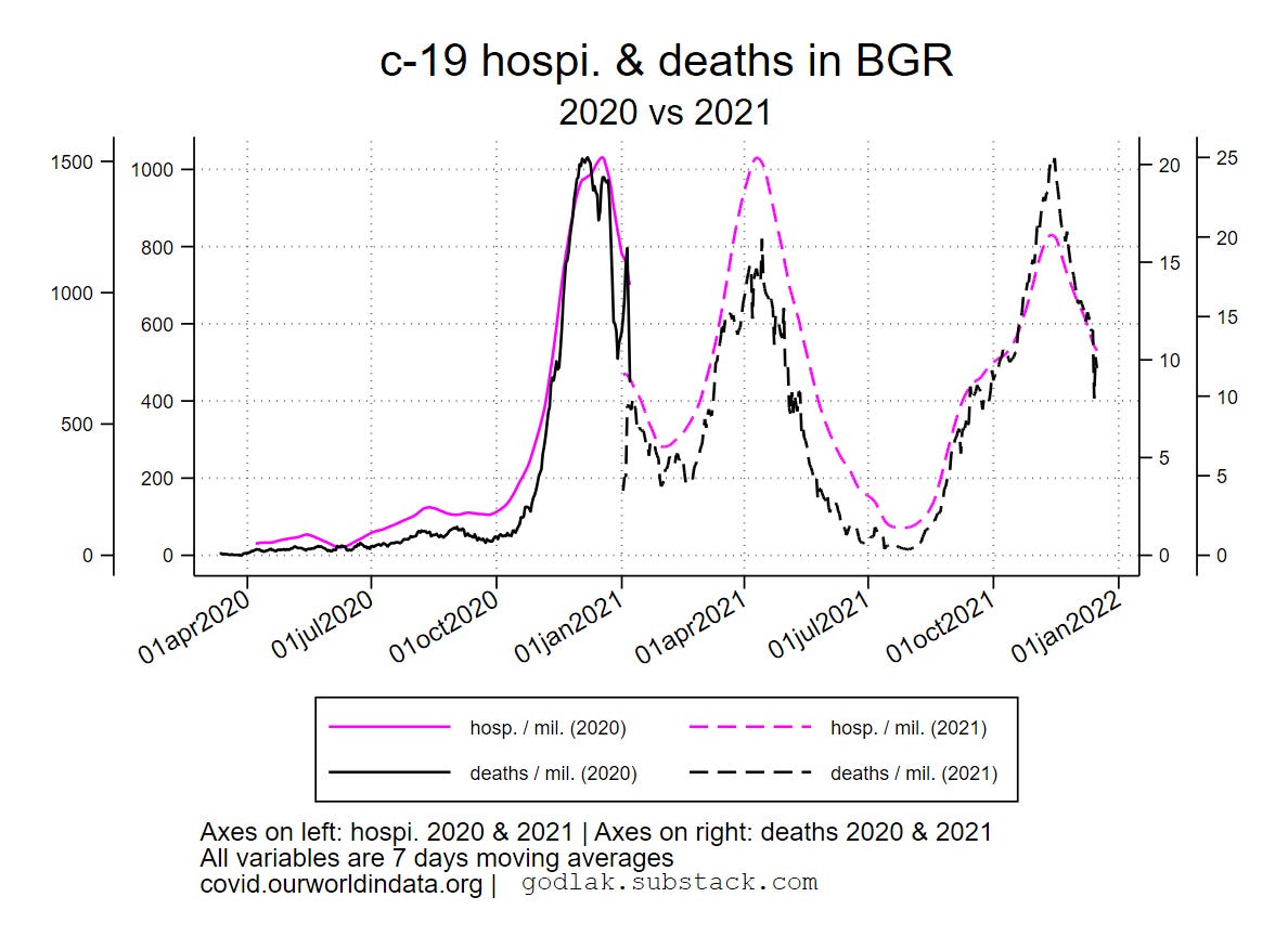
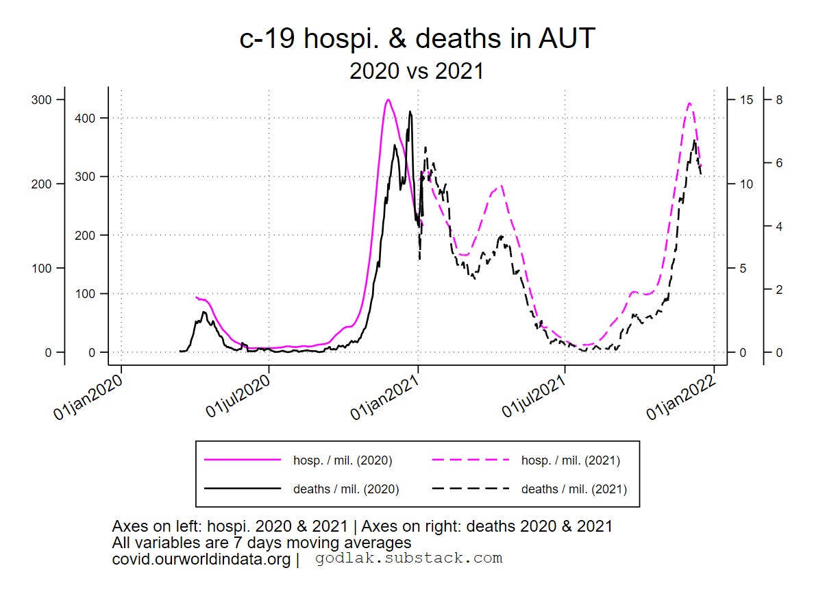
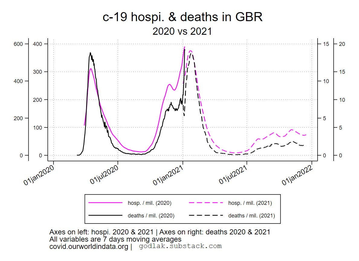
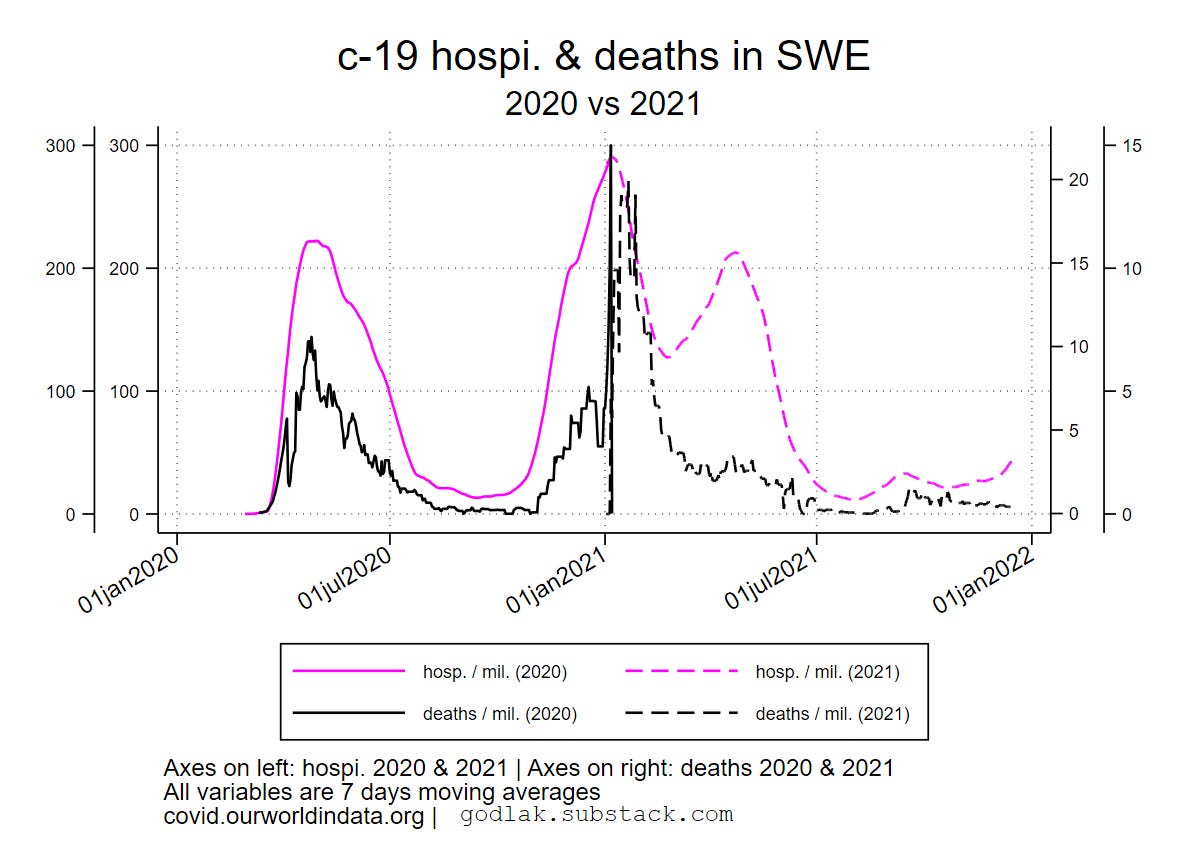
c-19 2021-2020 comparisons (tests & cases, hospitalizations & deaths) by ISO code (random order)


Data sources : https://ourworldindata.org/coronavirus & https://ec.europa.eu/eurostat/

[only countries with full data available for all variables are used (no eurostat data for UK though…)]

For c-19 (…) graphics, variables used are (all smoothed using 7 days moving average transformation): new “tests” / 1000, new positives / million, hospitalizations / million, deaths / million, new “vaccinations” / million, boosters / 100.

For all deaths (…) graphics, variables used are: all deaths (weekly), c-19 new deaths / million (weekly sum), new “vaccinations” / million (weekly sum), boosters / 100 (weekly sum).All graphics also available here: https://mega.nz/folder/T2omgIaa#ISqHFuLt2bx3fHaBdNrm6A