

Country level COVID-19 curves in Europe
Country level COVID-19 curves in Europe
Update as of 28.01.2022

[see bottom for data sources & links to all graphics in png format] all graphics, ordered by country iso code, on 1 page here: https://godlak1.github.io/covid19/c19europe.html
Please feel free to share as widely as possible your country’s c-19 graphics, especially in front of all the rona apparatchiks who according to the current stage of wisdom & rona propaganda nudging will only show partial information but never the full picture!
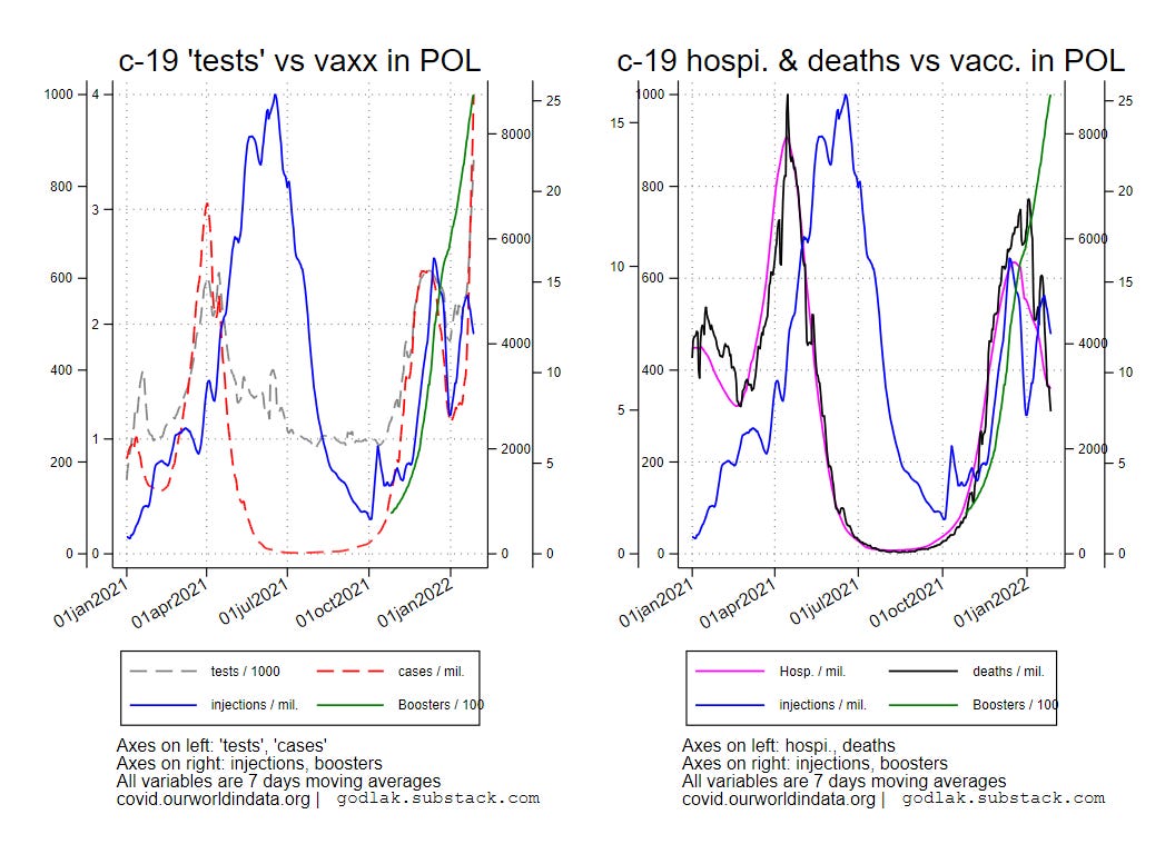
Let me just show here 2 countries : France & Poland
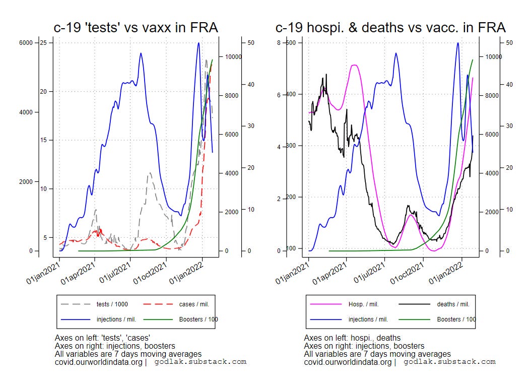
Despite the transformation of the “sanitary pass” into a “vaccinal (or recovered pass)” in France since monday, the new injections are falling… While “boosters” are still going up… The nasal sodomy madness continues with all its mechanical consequences… Hospitalizations curve is basically at the same level as the peak of spring 2021 although the “vaxx” coverage is currently much higher (+ “boosters”) in France… while the deaths curve is at half level compared to spring but continues going up…
A similar situation occurs in Poland where new injections are going down despite a stealth “sanitary pass” in place (basically venues such as restaurants have a capacity limit but those with a “pass” do not count for that limit…), while boosters continue going up… although nasal sodomy is less crazy, “cases” are going through the roof. For the current moment, as the season goes from East to West, hospitalizations and deaths curves are descending after reaching a seasonal peak. These peaks were not far from the spring 2021 peaks where “vaxx” coverage was much lower…
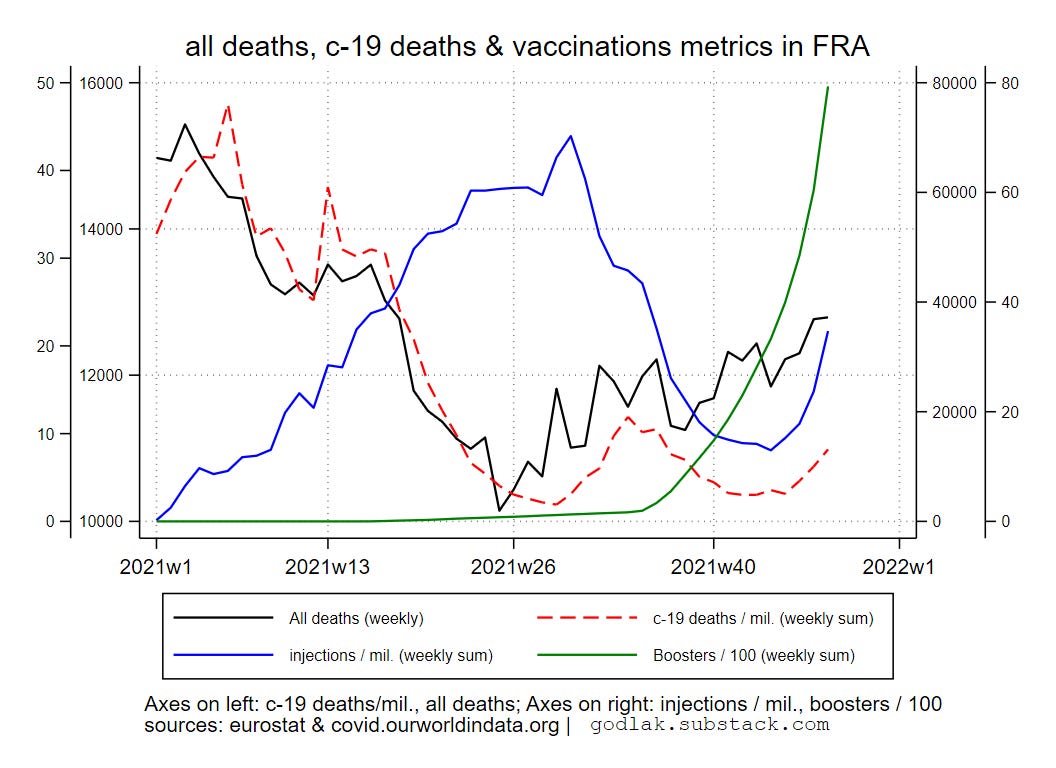
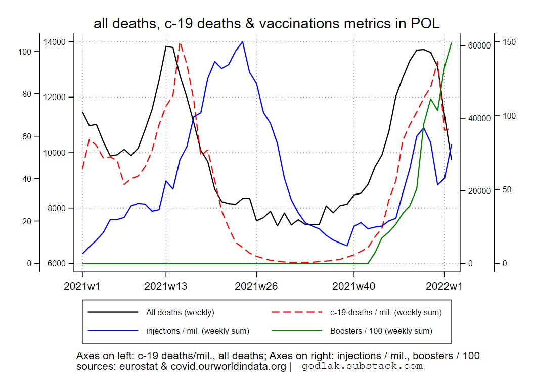
Unfortunately EUROSTAT data for France has not been updated. In Poland the situation follows the season although total deaths have reached the spring 2021 peak…
Data sources : https://ourworldindata.org/coronavirus & https://ec.europa.eu/eurostat/

[only countries with full data available for all variables are used (no eurostat data for UK though…)]

For c-19 (…) graphics, variables used are (all smoothed using 7 days moving average transformation): new “tests” / 1000, new positives / million, hospitalizations / million, deaths / million, new “vaccinations” / million, boosters / 100.

For all deaths (…) graphics, variables used are: all deaths (weekly), c-19 new deaths / million (weekly sum), new “vaccinations” / million (weekly sum), boosters / 100 (weekly sum).All graphics (png format) also available here: https://mega.nz/folder/T2omgIaa#ISqHFuLt2bx3fHaBdNrm6A