

Country level COVID-19 curves in Europe
godlak.substack.com
Country level COVID-19 curves in Europe
Update as of 21.01.2022

[see bottom for data sources & links to all graphics in png format] all graphics, ordered by country iso code, on 1 page here: https://godlak1.github.io/covid19/c19europe.html
Please feel free to share as widely as possible your country’s c-19 graphics, especially in front of all the rona apparatchiks who according to the current stage of wisdom & rona propaganda nudging will only show partial information but never the full picture!
Let me just show here 2 countries : France & Poland
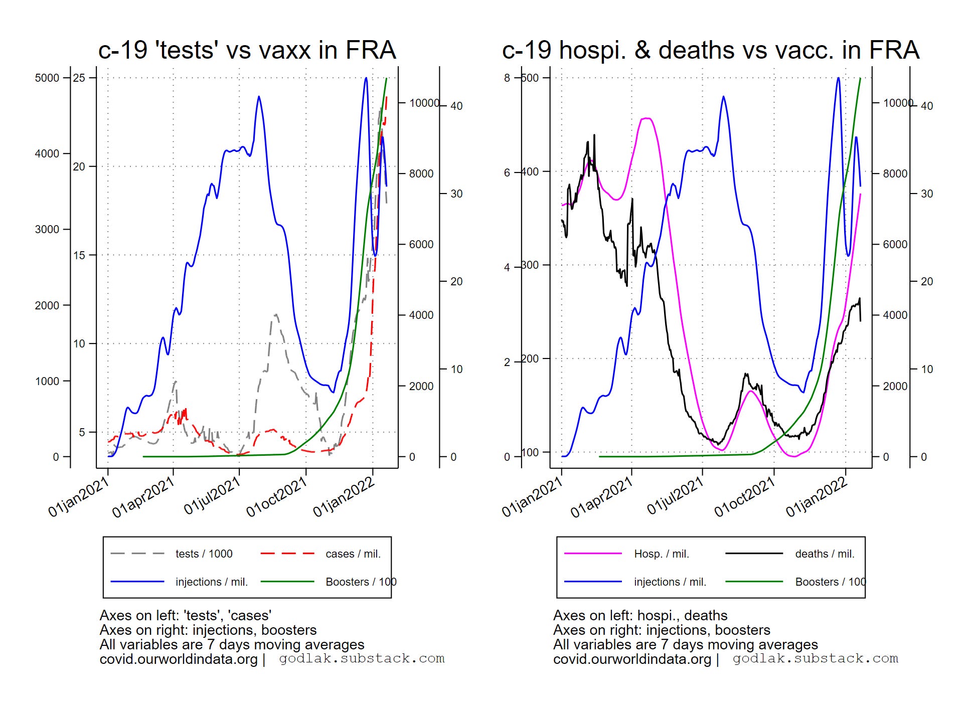

Hospitalizations curve approaches the peak of spring 2021 although the “vaxx” coverage is currently much higher (+ “boosters”) in France… while the deaths curve is at half level compared to spring…
An interesting co-tango pattern emerges for new injections and casses curves in Poland…
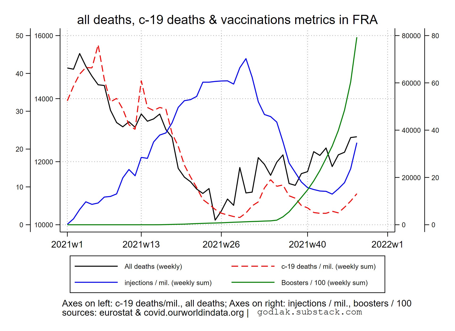

Total deaths remain relatively stable in France while they have reached the same peak as in spring 2021 but have now fallen in Poland.
Data sources : https://ourworldindata.org/coronavirus & https://ec.europa.eu/eurostat/

[only countries with full data available for all variables are used (no eurostat data for UK though…)]

For c-19 (…) graphics, variables used are (all smoothed using 7 days moving average transformation): new “tests” / 1000, new positives / million, hospitalizations / million, deaths / million, new “vaccinations” / million, boosters / 100.

For all deaths (…) graphics, variables used are: all deaths (weekly), c-19 new deaths / million (weekly sum), new “vaccinations” / million (weekly sum), boosters / 100 (weekly sum).All graphics (png format) also available here: https://mega.nz/folder/T2omgIaa#ISqHFuLt2bx3fHaBdNrm6A