

Covid-19 in Europe: PCR, hospi., deaths., vaccinations
Covid-19 in Europe: PCR, hospi., deaths., vaccinations
All data from covid.ourworldindata.org

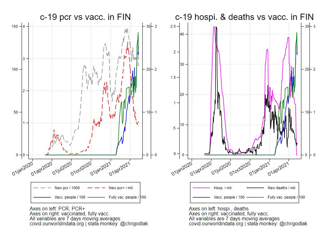
Let’s visualize the curves for PCR and PCR+ vs vaccinations on one hand and the curves for hospitalizations and deaths vs vaccinations by country in Europe!
I focus on the top 10 & bottom 10 countries w/r to the % of fully vaccinated citizen (in yellow in the table below) according to today data extraction; I provide graphics for countries for which all necessary data is available (hence countries in red are not shown as data on pcr or hospitalizations are missing).

All data are smoothed using 7 days moving average transformation (in tab. above, ma7pv & ma7pfv stand for 7 d. moving averages of vaccinated people / 100 and fully vaccinated people / 100 respectively)
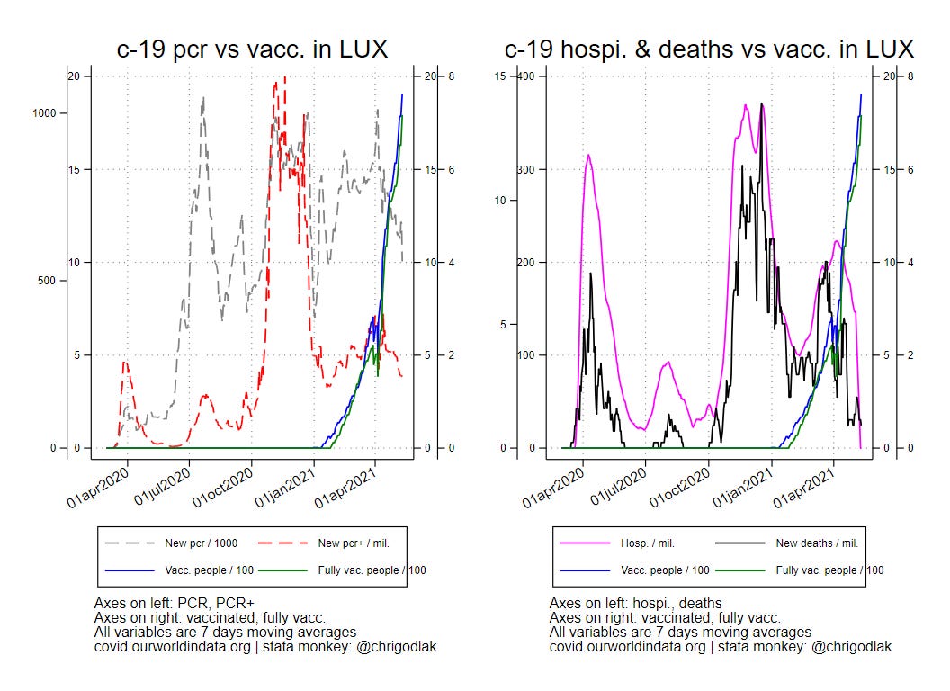
Let start with the top 10
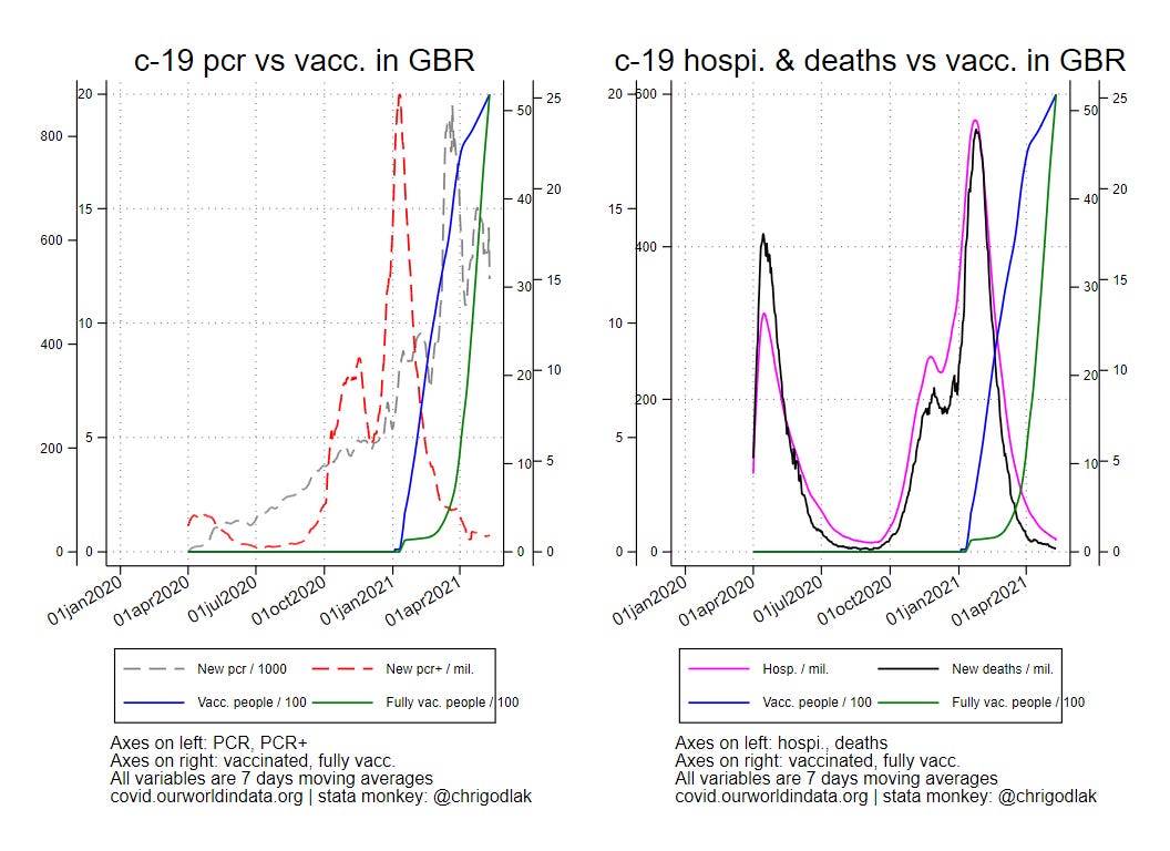

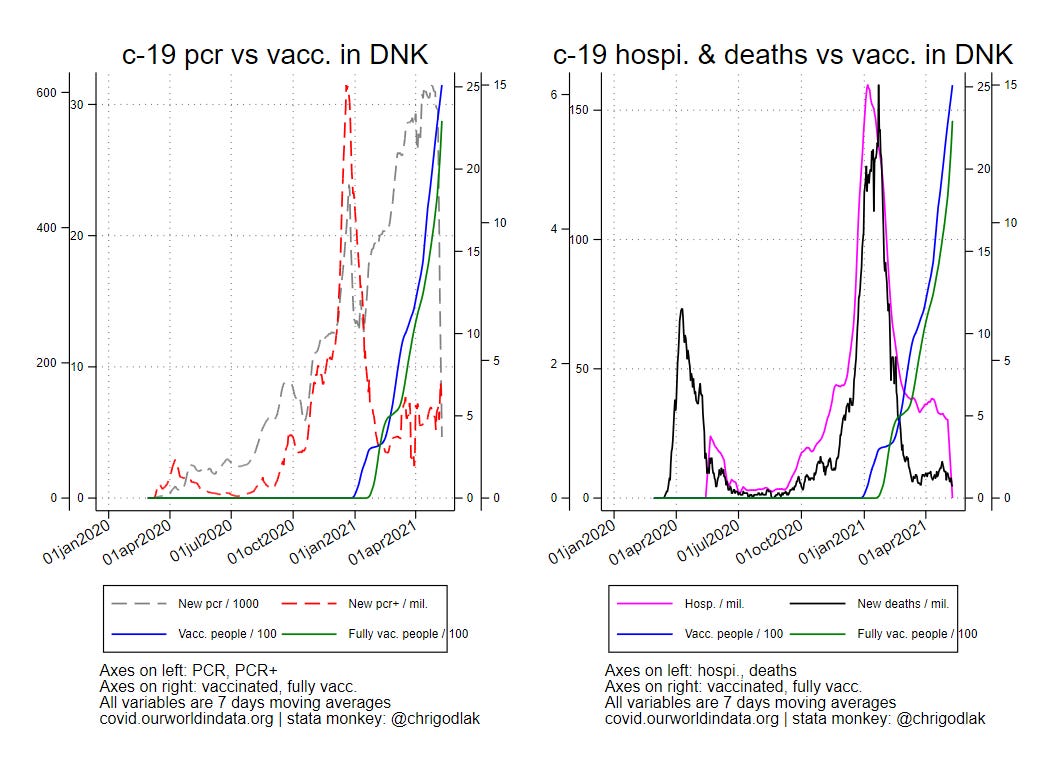


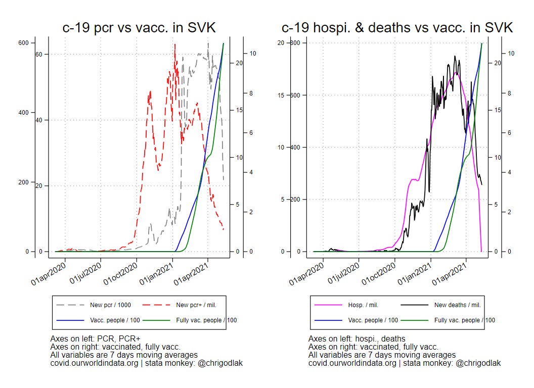
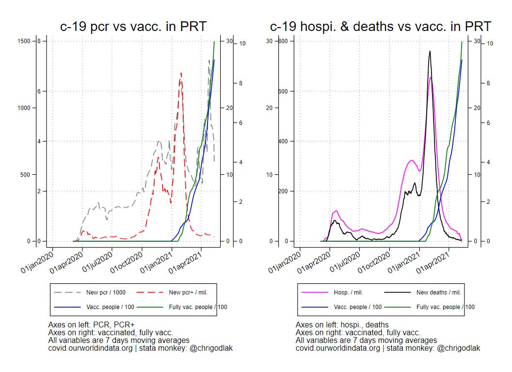
Surprisingly (?) in those top 10 countries in terms of fully vac. citizen % one notice that all of them reached a peak in PCR (and therefore everything that follows - PCR+, hospitalizations, deaths…) around half way in the vaccinations curves. In other words, there is an interesting coincidence between bringing down PCR intensity around the time when half of the performed vaccinations (looking from today) were reached…
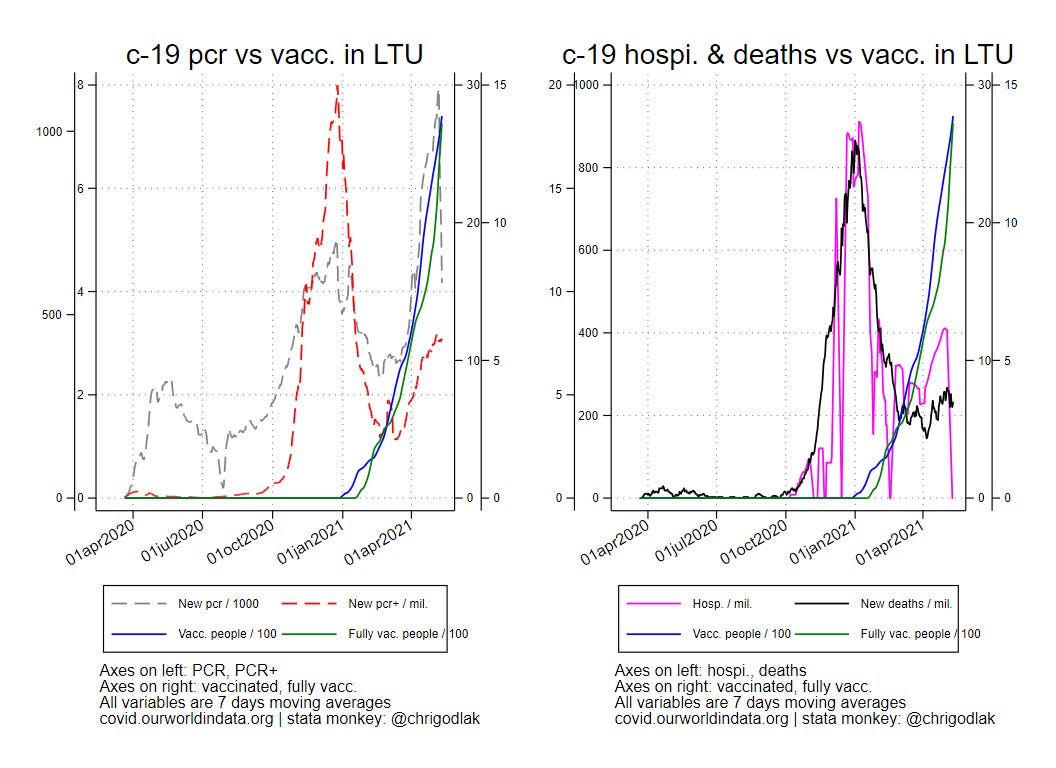
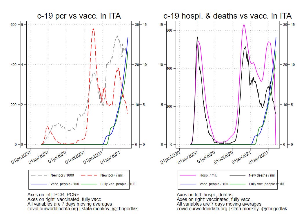
Now let see if these patterns also occur in the bottom 10 countries in terms of fully vac. citizen % ?


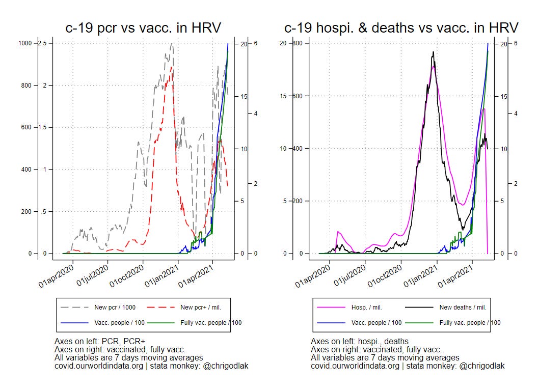

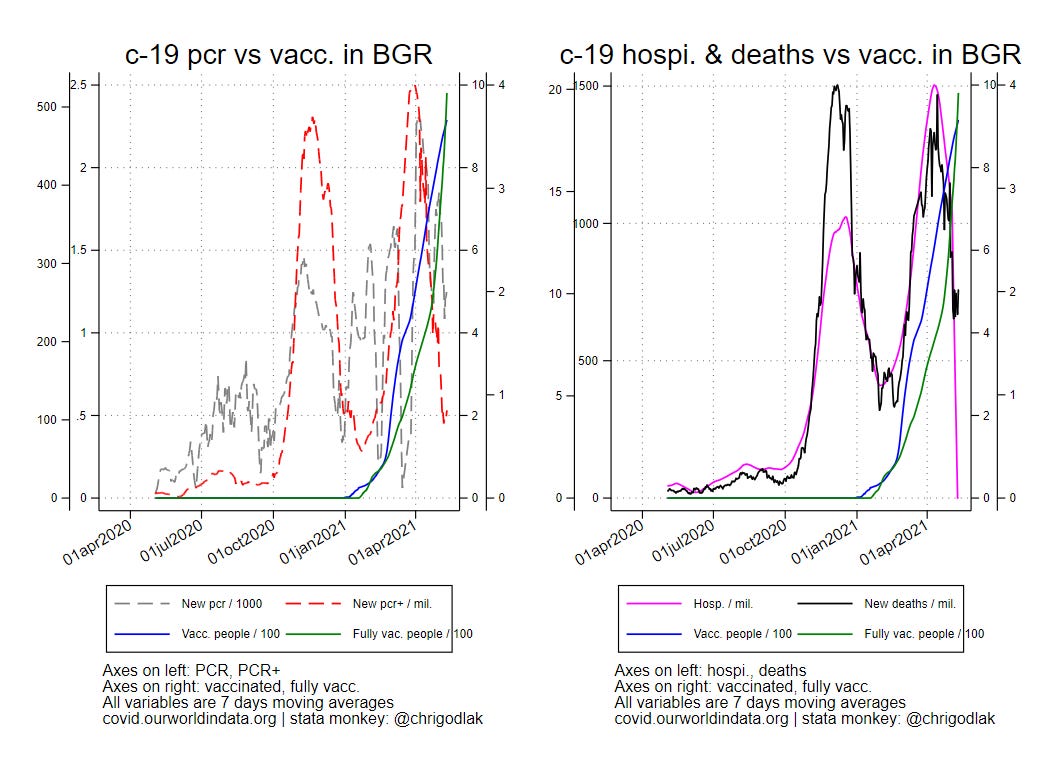

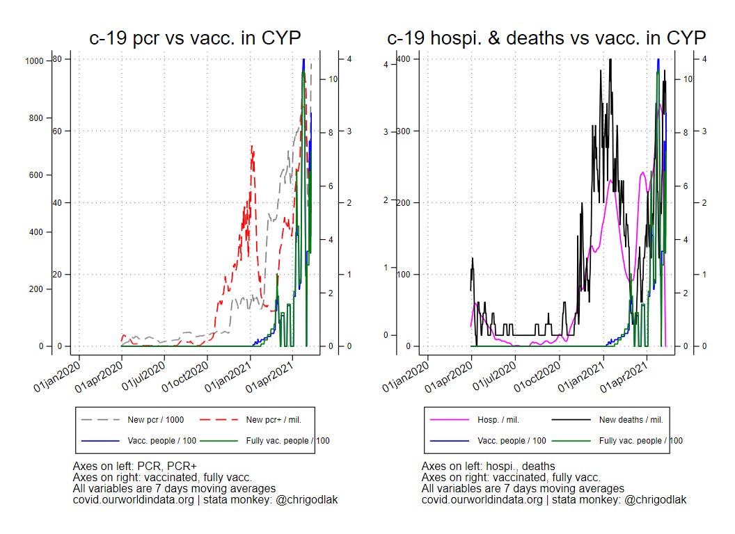
Overall we can reach a similar conclusion: with eventually notable exceptions of Croatia or Sweden or Cyprus (HRV & CYP having “chaotic” PCR curves…), again, we notice that an interesting coincidence between bringing down PCR intensity around the time when half of the performed vaccinations (looking from today) were reached…
Hence it can be easy to claim that vaccinations work while bringing PCR down (which is the puppet master since the beginning), without even mentioning the effect of seasonality (spring, temperature, UV, and so on…)