


Covid-19 in Europe: vaccines vs cases, hospitalizations, and deaths by country

2021 statistical & data visualization wrap-up of covid-19 in Europe
This is my last post in 2021. For this occasion, I thought i will redo a simple analysis focused on c-19 vaccines and the usual c-19 outcomes that were gaslighed upon us for almost 2 years (i did something already in the past, see links below). As a full year of injections has passed, it is worthy to dive in to close this 2nd rona year 2021.

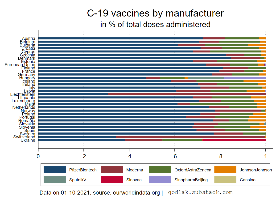
Vaccine types and evolution by country
Let start with the vaccines. Below you can visualize the types of injections for several european countries as of 1.10.2021 (in order to have the maximum of countries with available data). Without surprise, Pfizer injection is winning, although Moderna appears as a serious contender in Liechtenstein or Switzerland. Notice also the presence of “classic / traditional” vaccines such as Sinopharm in Hungary or Sinovac in Ukraine.
Visualizations of the evolution of types of vaccines administered by country can be found in this folder: https://mega.nz/folder/GmRVCIhS#NbUOd_8cLKmTONrIawuEMA
Most of curves are stable since start by country, with some notable exceptions in Liechtenstein, Latvia, and Ukraine. This might be worthy of deeper investigation but will not be considered hereafter.


Positivity vs people fully vaccinated & new vaccinations
In this first part, I plot for each country the daily variations of the percentage of positive “cases” (to account for “testing” intensity) vs the 14 days lagged daily variations of the people fully vaccinated (/ 100) and of the new injections (/ million) and i add a linear fit, based on a linear robust regression including weekly dummies (to account for time hence seasonality). The robust term means that data heterogeneity is taken into account when computing the coefficients’ standard errors (i.e. it’s “cleaner” to proceed that way to not overshoot the statistical signifance of the coefficients due to “noise” in the data).
All graphics are available here: with people fully vaccinated as explanatory variable https://mega.nz/folder/GjQTCITJ#Ks8pLKMx41zCLreio_LGhQ and with new injections as explanatory variable https://mega.nz/folder/v6YVUSjQ#ciInF690k43Kk01OqnZOyw
I will present and discuss below the results for 2 countries: France and Poland, then i will show the regressions’ coefficients for each country.


The results are not particularly breathtaking… Scatter plots are concentrated around 0 for daily variations in people fully vaccinated or new injections, while the daily variations in % positives are swinging between -10% and + 10%.
Below the regression coefficients by country are depicted.
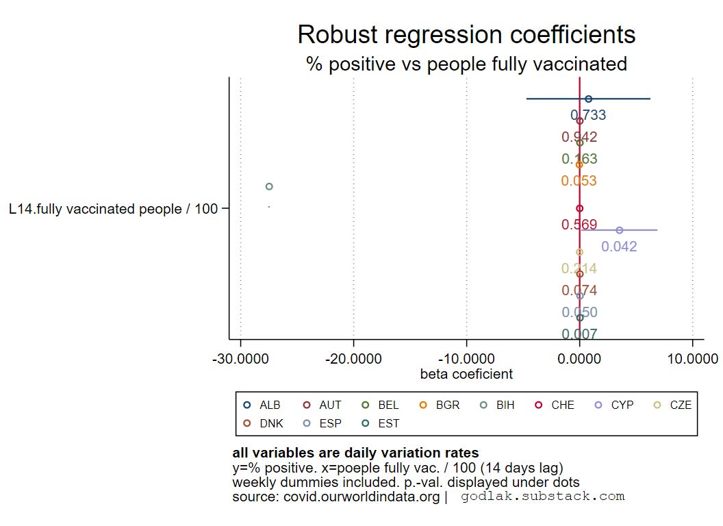


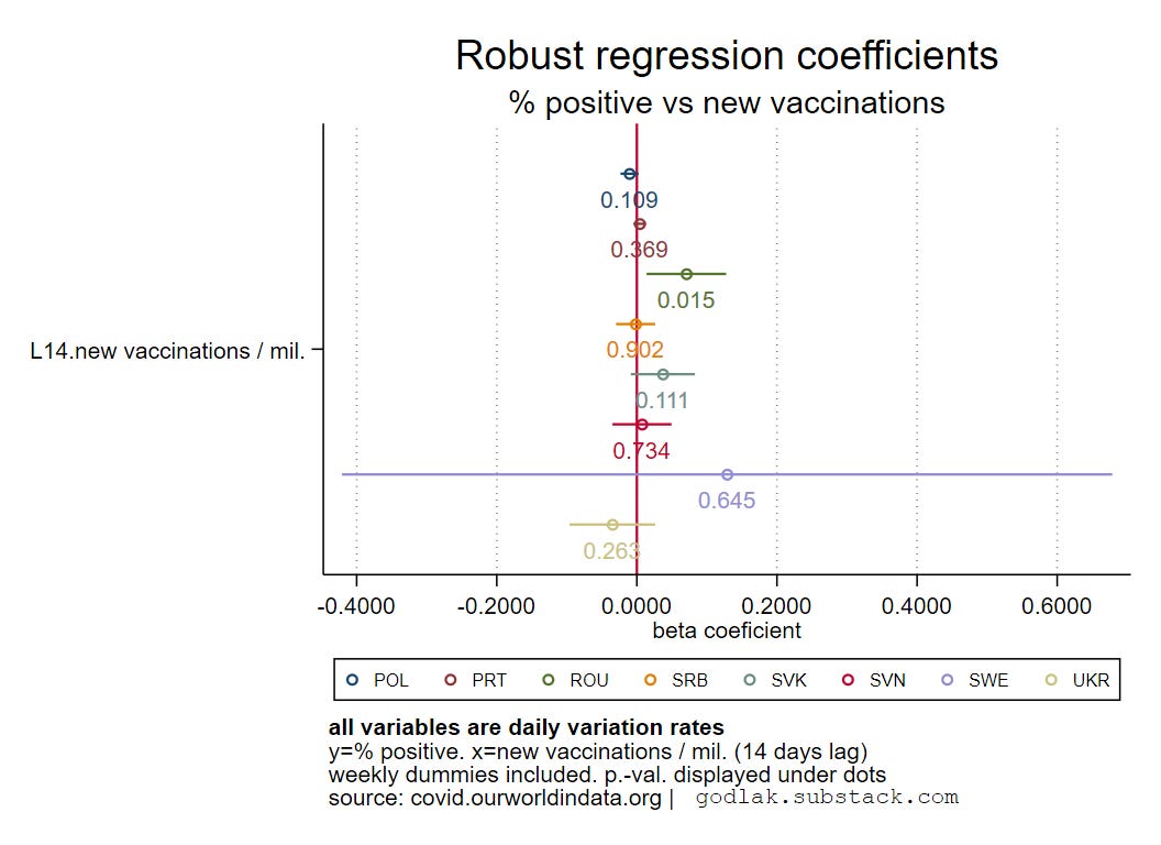
Most of the coefficients are around 0 and not significant. Therefore, no statistical relationship between the daily variations in % positive “cases” and people fully vaccinated or new injections.
As the results are comparable with people fully vaccinated and with new injections, i will keep the specification using new injections hereafter, as it captures the “dynamics” of the vaccinations more properly.
Hospitalizations vs new vaccinations
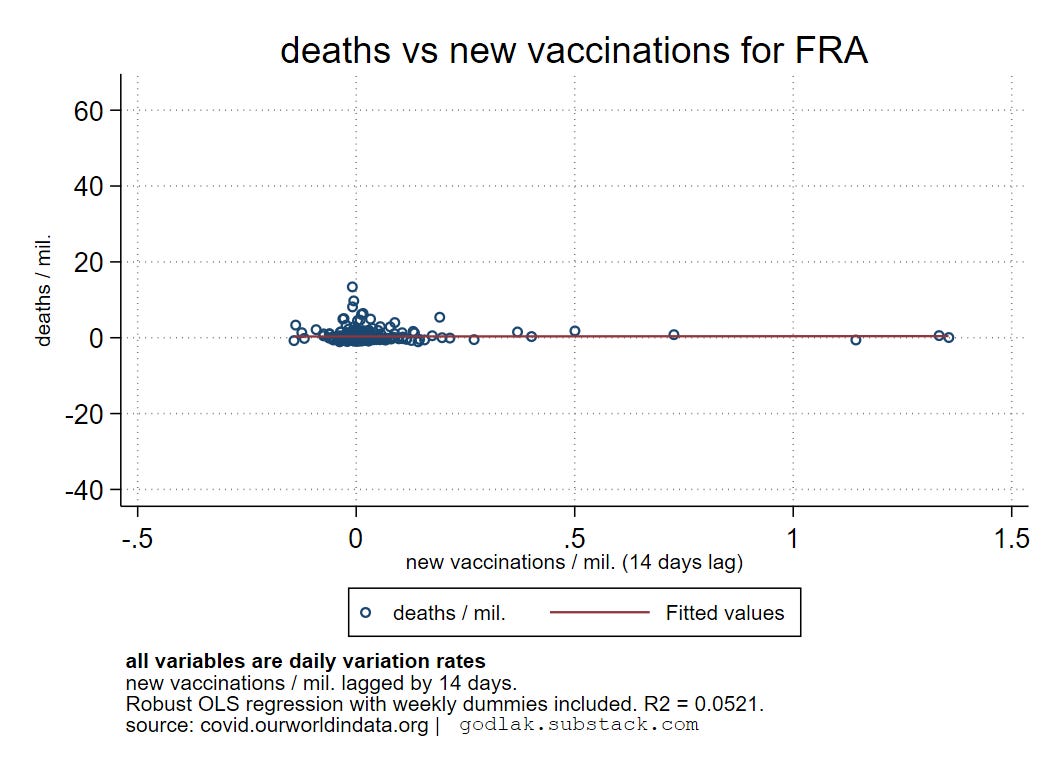
In this second part, I plot for each country the daily variations of the c-19 hospitalizations (/ million) vs the 14 days lagged daily variations of the new injections (/ million) and i add a linear fit, based on a linear robust regression including weekly dummies (to account for time hence seasonality).
All graphics are available here: https://mega.nz/folder/OiIH3CiJ#u6FINjz3YPWrG17muCvWug
Again, I will present and discuss below the results for 2 countries: France and Poland, then i will show the regressions’ coefficients for each country.


Again, the results are not breathtaking, scatter plots are concentrated.
Below the regression coefficients by country are depicted.


Again, most of the coefficients are around 0 and not significant. Therefore, no statistical relationship between the daily variations in c-19 hospitalizations and new injections.
Deaths vs new vaccinations
In this third and last part, I plot for each country the daily variations of the c-19 deaths (/ million) vs the 14 days lagged daily variations of the new injections (/ million) and i add a linear fit, based on a linear robust regression including weekly dummies (to account for time hence seasonality).
All graphics are available here: https://mega.nz/folder/KzI1iKCD#8kejaLX40ko5QsPIVeXQww
Again, I will present and discuss below the results for 2 countries: France and Poland, then i will show the regressions’ coefficients for each country.
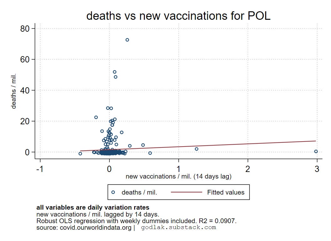
Again, nothing breathtaking…
Below the regression coefficients by country are depicted.


Again, most of the coefficients are around 0 and not significant. Therefore, no statistical relationship between the daily variations in c-19 deaths and new injections.