This particular tweet nudge by a prominent and regular French rona journalist triggered my attention today:


translation: ”Europe appears to be split in 2: West with a high vaxx coverage & low number of daily (c-19) deaths, East less vaxxed (…) & high mortality”
After months of silence, the “c-19 deaths” nudge is back!
But let’s look at the graphic first:
Vaxx coverage is computed using the most recent data while mortality is for the last week… meh. How is fall in east vs west already ? Any chances that colder weather in east gives already more respiratory infections labelled c-19 thanks to the magic Drosten “test” ?
But wait there is more! Let focus on France, shown as a champion of the west (it’s a french journalist…) and the anti-champion of the east = Ukraine.
(hospitalizations data are n.a. on owid for UKR)
What a surprise! More “tests”, more “cases” and more “c-19 deaths” in Ukraine. And the exact opposite in France. Of course the more vaxxed you have the less you will “test” them so mechanically with less vaxxed, you “test” more (aka “the test is the virus”). But still, what is needed for context is indeed these curves.
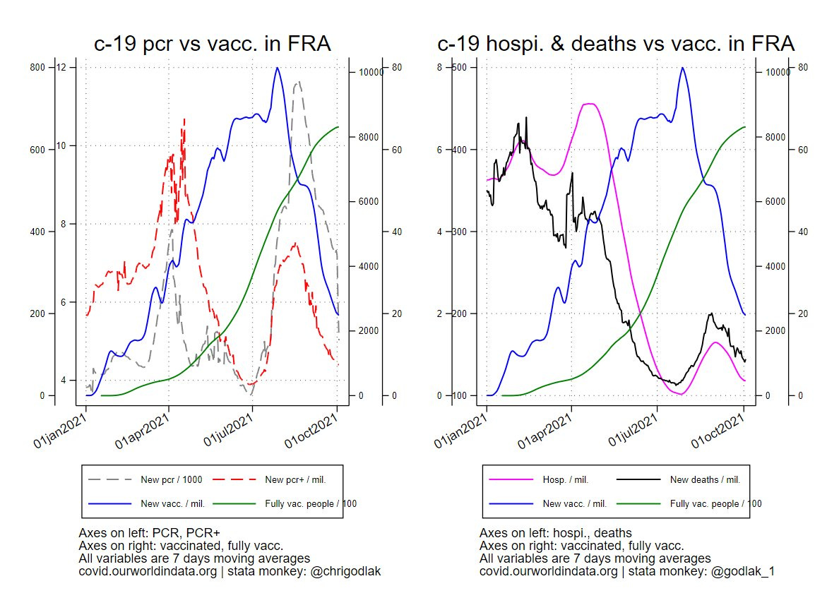
But wait there is even more! Let’s plug in the curve of new vaccinations per million per day:
What an interesting coincidence! Ukraine increase in new vaxx lags the other curves and finally the mortality one. In France, this phenomenon is also visible but earlier, starting in july. What happened in july? Macron announced the infamous rona pass! Again, the “test”, “cases” and “c-19 deaths” curves followed the new vaxx curve.
However, these curves also point that there seems to be some non linearities playing (some things seem to occur at specific thresholds?) and also when you pump up the vaxx operations (in warm vs cold times?).
Finally, let’s look at some scatter plots, linear fits, and regression coefficients (all variables are smoothed using 7 days moving average transformation).
First, new c-19 deaths as a function of fully vaxxed people (lagged by 14 days):
We see that linear fits have a negative slope in both countries (with almost 100% R² btw) but the scatter plot in Ukraine goes up at around 7% of fully vaxxed (coincidentally when fall kicks in?). The average coefficient is very tiny and barely negative for France (i.e. more fully vaxxed associated with less deaths but the link is small), and tiny as well but positive for Ukraine (i.e. more fully vaxxed associated with more deaths but the link is small).
Second let’s do the same excercise but using the new vaccinations per million per day as the explanatory variable:
Scatter plots are now all over the place (and Ukraine has it’s uptick towards 3000/million new vaxx) but the linear fits have again a negative slope (and R² are close to 100%). The average coefficient is 0 and non significant for France (at this stage more new vaxx doesn’t do anthing to c-19 deaths… for now) while the coefficient is very tiny and positive for Ukraine.
Moral of the story:
- don’t trust journalists and their framed cherry picked graphics
- always take into account “tests” as they drive everyting
- think about vaxx coverage AND new vaccinations
Producing quantile regressions or going into non linear specifications would be also interesting to shed some light into this… Because it appears that some fully vaxx and.or new vaxx thresholds seem to play as well as when the vaxx campains are pushed (warm vs cold seasons).
Bonus (only doable for France with eurostat data):
plugging in all causes deaths until week 35; notice that “c-19” deaths and total deaths are in full tango mode…


