


Google mobility vs stringency index vs covid-19 metrics
Data from google.com/covid19/mobility/ + covid.ourworldindata.org * focus on European countries

[ Disclaimer: This is going to be a huge dump of graphics so bear with me :) ]
All graphics are on my GitHub
In the post, i will provide links to GitHub pages with graphics as well
Aim
Analyze the evolution over time and by country (Europe exclusively) of proxies for:
population mobility
NPI (stringency)
covid-19 metrics (“tests”, “cases”, positivity rate, reproduction rate)
Analyze the correlations between:
mobility and stringency
mobility and covid-19 metrics (ibid)
Data and variables
Google mobility ? An overview can be found here with more details here
Basically these are measures of “movement trends”, as explained below:

Data comes in daily percent change from baseline at country, region, etc. level; i will use the country level data. 6 “places” are available:
Retail & recreation
Grocery & pharmacy
Parks
Transit stations
Workplaces
Residential
I also computed 2 “averages”: 1 using all the places (Mobility) and 1 using all places but excluding parks (Mobility (no parks). To smooth the data, i compute 7 days moving averages for all variables above.
I will be using the Stringency Index or its 7 days lagged value. Definition of this index is here. Broadly, “this index simply records the number and strictness of government policies” such as, for e.g., schools’ closure or stay at home requirements.
Finally, covid-19 metrics (7 days moving averages) will be (more information here):
new tests / 1000
new cases / million
positive rate
reproduction rate
Evolution of mobility by places over time and country (East vs West Europe)
All graphics for this part are on these pages: East & West. Please check them out to see the evolution of mobility by “places”.
I will show here the averages of all mobility places (with & without parks)
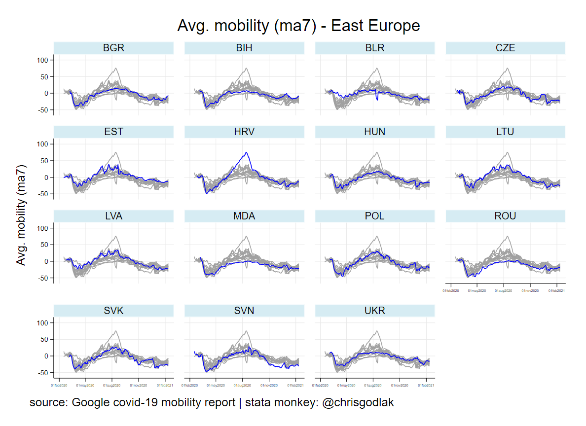
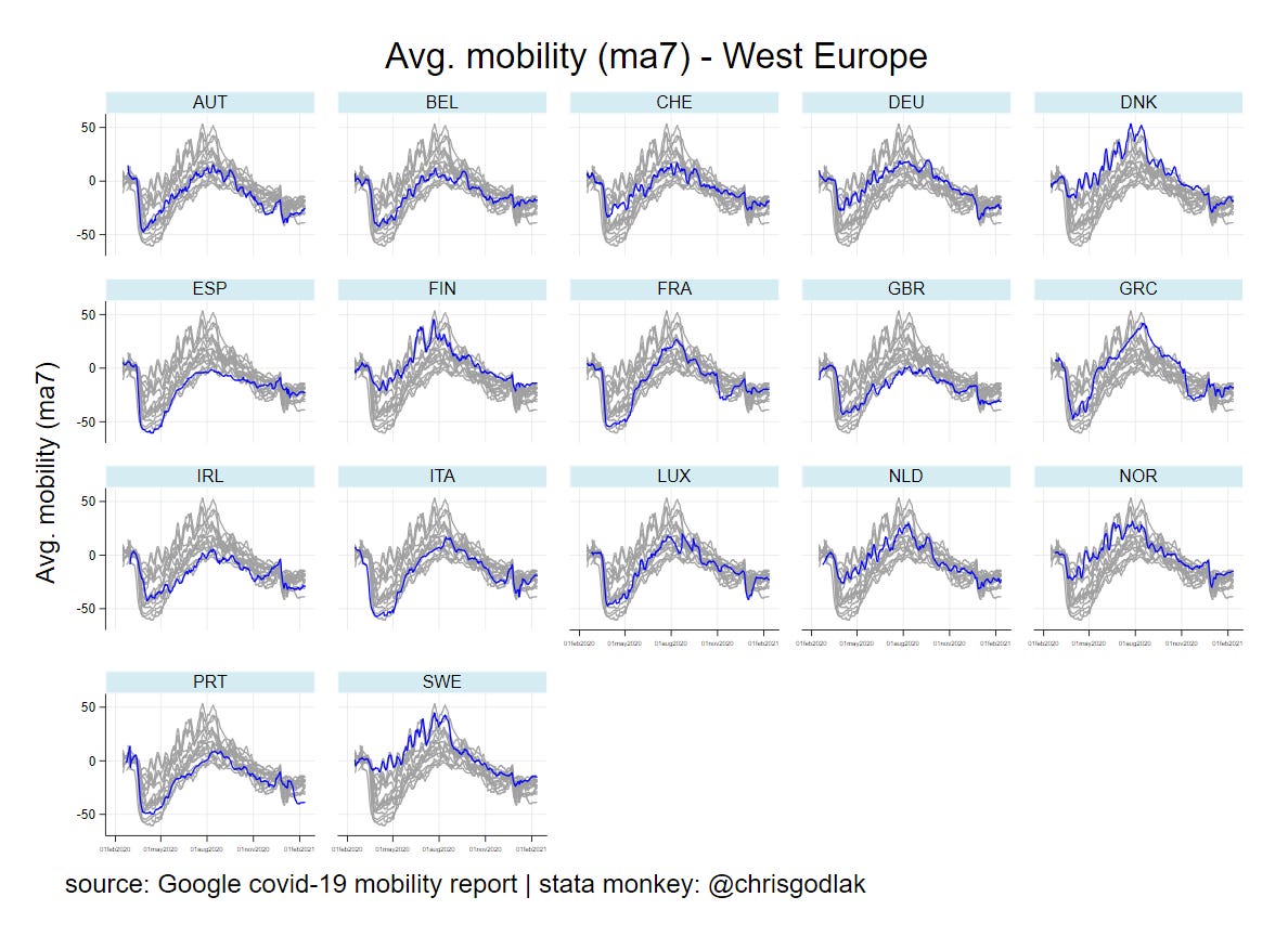
Overall mobility is far more reduced in West; the largest dumps are in spring (except for instance Sweden, but not only). Notice the huge spike in Croatia but also in Denmark, Finland, Sweden and Greece… Don’t hold your breath: this is due to what google calls “parks” :) or what i would call “outdoor mobility” which is of course affected by seasonality (and what google considers as the baseline as well)


Indeed, without “outdoor mobility” things look different, except Greece eventually.
Overall, google seems to capture the effects of NPI put in place…
Evolution of stringency & covid-19 metrics over time and country (East vs West Europe)
All graphics for this part are on these pages: East & West. Again, check them out for the details.
I will show here the stringency index and reproduction rate.


Without suprises, the stringency index follows a pattern that is the “negative” of mobility. Except Belarus, all other countries have a bump in stringency in spring for instance.
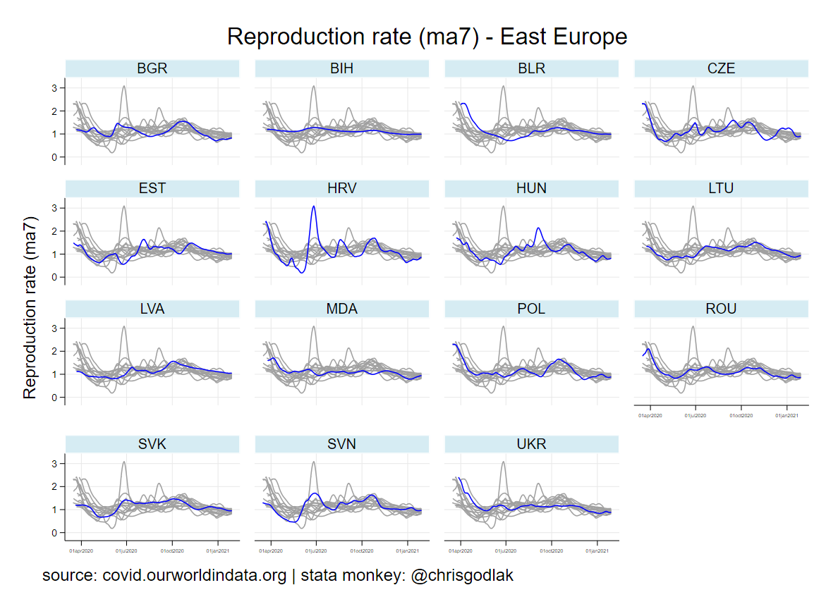

Now regarding the reproduction rate, which is the “ultimate product” from “tests” and “cases”, we notice huge spring “cliffs” in West and overall similar rather “flat” (around 1) patterns for most countries. Sweden is again an outlier and looks like most of East countries. Notice the summer peak in Croatia.
Mobility vs stringency & mobility vs covid-19 metrics (aggregated by East vs West Europe)
Here i start with bin scatter plots with histograms, confronting mobility (by “place”) and stringency index. Bin groups the x-axis variable (i.e. stringency) into equal-sized bins, computes the mean of the x-axis and y-axis variables within each bin, then creates a scatterplot of these data points. This gives a “reduced form” visualization of the relationships between x and y. Histograms for x and y are also shown.
Here results are aggregated by all countries: East vs West.
Again, all graphics for this part are on these pages: East & West.
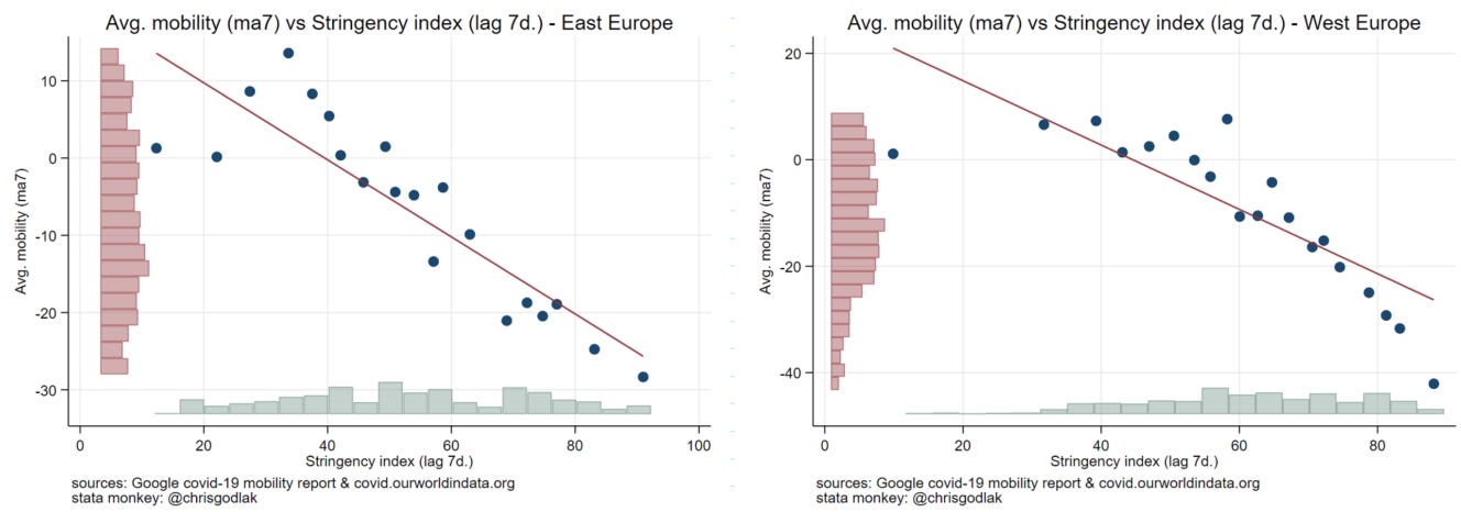
I will show here the average mobility vs stringency index. Just to make sure that mobility is negatively related to stringency (7 days lag in case of). Indeed, it is :) Notice average mobility is more homogenous in East (cf. red histogram).
Now how it relates to covid-19 metrics? Again all graphics are on these pages: East & West.
I will show here the new cases (per milion), positive rate, and reproduction rate vs average mobility.
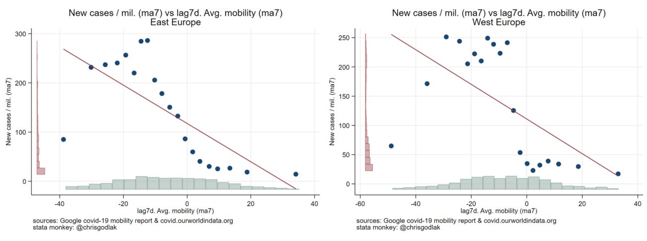
The pattern is “smoother” in East but neverthless, notice more cases with less mobility.

Positive rate is higher with lower mobility.
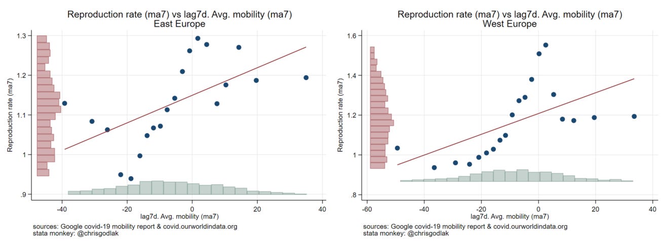
Interesting to notice those peaks around 0 mobility (i.e. percent change w/r baseline) and reproduction rate… Like doing nothing is related to higher reproduction rate…
Mobility vs stringency & mobility vs covid-19 metrics (by country : East vs West Europe)
Here a similar excercise is performed but by country (with “bins”) and results are all shown on the same graphic; i.e. multiple scatter plots by country on same graphic.
Again, all graphics for this part are on these pages: East & West.
I will show here the average mobility vs stringency index as previously.


Again, negative link between mobility & stringency, although 2 Western Europe countries “disagree” :) (park lovers)
Now let check how mobility relates to covid-19 metrics. Again all graphics are on these pages: East & West. I recommend checking these graphs, it’s worth the trip :)
I will show here the reproduction rate vs average mobility.


Basically, it’s a mess :) Looks like someone was playing mikado… For some countries reproduction rate is a positive function of mobility, for others it’s the other way around…
Mobility vs stringency & mobility vs covid-19 metrics (scatter plot by country : East vs West Europe)
Finally, I show everything at country level with all data points ! These graphics are similar to the ones show at the beginning of this post.
Again, all graphics for this part are on these pages: East & West.
I will show the average mobility vs stringency index as previously.


Overall we notice a rather negative link between mobility and stringency, but heterogeneity is huge. Link appears less negative in East.
And let have a look at mobility vs covid-19 metrics. Again all graphics are on these pages: East & West. Check them out :)
I will show here the reproduction rate vs average mobility.


We notice interesting patterns here. For instance Bosnia or Sweden are flat; whatever the mobility, reproduction rate is around 1. While Croatia or Poland have those nice “snake” shapes, where reproduction rate can be higher or lower whatever the mobility… These shapes are more common in most of Western Europe countries… These are of course related to the initial drop in mobility from spring while reproduction rate stabilizes later on around 1 anyway…
If you are still here with me, thank you ! What is the main takeaway ? Well stringency and mobility are related of course, but mobility & covid-19 metrics related to “cases” and things related to that… not that much :)